UI Builder Plugin
Visual drag-and-drop page builder with component registry, variables, and public page rendering
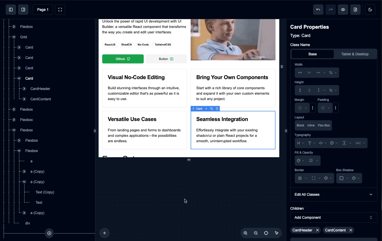
The UI Builder plugin provides a visual drag-and-drop page creation interface where administrators can create pages using pre-defined components. Pages are stored as JSON layers in the CMS and can be rendered on public routes.
For comprehensive documentation including interactive demos, block templates, and advanced customization options, visit uibuilder.app.
Key Features:
- Visual Page Builder - Drag-and-drop interface for creating pages with components
- Component Registry - Pre-built shadcn/ui components + custom component support
- Variables - Define page variables for dynamic content
- CMS Integration - Leverages the CMS plugin for data persistence
- Public Page Rendering - Render pages by slug with the
PageRenderercomponent - SSR Authorization - Lifecycle hooks for protecting admin pages
Installation
Ensure you followed the general framework installation guide first. The UI Builder requires the CMS plugin to be configured.
1. Add Content Type to CMS Backend
The UI Builder stores pages as CMS content items. Add the pre-configured content type to your CMS:
import { stack } from "@btst/stack"
import { cmsBackendPlugin } from "@btst/stack/plugins/cms/api"
import { UI_BUILDER_CONTENT_TYPE } from "@btst/stack/plugins/ui-builder"

const { handler, dbSchema } = stack({
  basePath: "/api/data",
  plugins: {
    cms: cmsBackendPlugin({
      contentTypes: [
        UI_BUILDER_CONTENT_TYPE,
        // ... other content types
      ],
      hooks: {
        // Optional: Add authorization for CMS operations
        onBeforeListContent: async (typeSlug, ctx) => {
          if (typeSlug === "ui-builder-page") {
            const session = await getSession(ctx.headers)
            if (session?.user?.isAdmin !== true)
              throw new Error("Admin access required")
          }
        },
      },
    })
  },
  adapter: (db) => createMemoryAdapter(db)({})
})

export { handler, dbSchema }
2. Add Plugin to Client
Register the UI Builder client plugin:
import { createStackClient } from "@btst/stack/client"
import { cmsClientPlugin } from "@btst/stack/plugins/cms/client"
import { uiBuilderClientPlugin, defaultComponentRegistry } from "@btst/stack/plugins/ui-builder/client"
import { QueryClient } from "@tanstack/react-query"
import { redirect } from "next/navigation"

const getBaseURL = () =>
  process.env.BASE_URL || "http://localhost:3000"

export const getStackClient = (queryClient: QueryClient, options?: { headers?: Headers }) => {
  const baseURL = getBaseURL()
  return createStackClient({
    plugins: {
      // CMS plugin is required
      "cms": cmsClientPlugin({
        apiBaseURL: baseURL,
        apiBasePath: "/api/data",
        siteBaseURL: baseURL,
        siteBasePath: "/pages",
        queryClient,
        headers: options?.headers,
      }),
      // UI Builder plugin
      "ui-builder": uiBuilderClientPlugin({
        apiBaseURL: baseURL,
        apiBasePath: "/api/data",
        siteBaseURL: baseURL,
        siteBasePath: "/pages",
        queryClient,
        componentRegistry: defaultComponentRegistry,
        headers: options?.headers,
        hooks: {
          // SSR authorization hooks
          beforeLoadPageList: async (context) => {
            const session = await getSession(context.headers)
            return session?.user?.isAdmin === true
          },
          beforeLoadPageBuilder: async (pageId, context) => {
            const session = await getSession(context.headers)
            return session?.user?.isAdmin === true
          },
          onLoadError: (error, context) => {
            redirect("/auth/sign-in")
          },
        },
      })
    }
  })
}
3. Configure Provider Overrides
Add UI Builder overrides to your layout:
import type { UIBuilderPluginOverrides } from "@btst/stack/plugins/ui-builder/client"
import type { CMSPluginOverrides } from "@btst/stack/plugins/cms/client"

type PluginOverrides = {
  "cms": CMSPluginOverrides,
  "ui-builder": UIBuilderPluginOverrides,
}

<StackProvider<PluginOverrides>
  basePath="/pages"
  overrides={{
    "cms": {
      apiBaseURL: baseURL,
      apiBasePath: "/api/data",
      navigate: (path) => router.push(path),
      refresh: () => router.refresh(),
      Link: ({ href, ...props }) => <Link href={href || "#"} {...props} />,
    },
    "ui-builder": {
      apiBaseURL: baseURL,
      apiBasePath: "/api/data",
      navigate: (path) => router.push(path),
      refresh: () => router.refresh(),
      Link: ({ href, ...props }) => <Link href={href || "#"} {...props} />,
      componentRegistry: defaultComponentRegistry,
    }
  }}
>
  {children}
</StackProvider>
4. Install Required Dependencies
The UI Builder uses the Tailwind Typography plugin for the Markdown component. Install it as a dependency:
npm install @tailwindcss/typography
# or
pnpm add @tailwindcss/typography
5. Import CSS
This step is critical for the UI Builder to work correctly.
The UI Builder uses a large number of Tailwind utility classes for dynamic component styling. Add the CSS import to ensure Tailwind v4 scans all required classes:
@import "@btst/stack/plugins/ui-builder/css";Without this CSS import, many styling options in the UI Builder will not work because Tailwind won't include the dynamic classes.
Admin Routes
The UI Builder plugin provides these admin routes:
| Route | Description |
|---|---|
/ui-builder | List all pages with create, edit, delete actions |
/ui-builder/new | Create a new page with the visual builder |
/ui-builder/:id/edit | Edit an existing page |
Admin routes are automatically set to noindex for SEO. Don't include them in your public sitemap.
Page Component Overrides
You can replace any built-in admin page with your own React component using the optional pageComponents field in uiBuilderClientPlugin(config). The built-in component is used as the fallback whenever an override is not provided. Overrides for parameterized routes receive the route context ({ params }) as props.
uiBuilderClientPlugin({
  // ... other config
  pageComponents: {
    // Replace the page list page
    pageList: MyCustomPageList,
    // Replace the new page builder page
    newPage: MyCustomNewPage,
    // Replace the edit page builder page — receives the route context as props
    editPage: ({ params }) => <MyCustomPageBuilder id={params.id} />,
  },
})
Component Registry
The UI Builder uses a component registry to define available components. A default registry is provided with common components:
Default Components
Primitives:
div,span,p,h1-h6- HTML elementsa- Anchor linksimg- Imagesiframe- Embedded content
Layout Components:
Flexbox- Flexible box layoutGrid- CSS Grid layout
Content Components:
Markdown- Rich text with Markdown supportIcon- Lucide iconsCodePanel- Syntax-highlighted code blocks
shadcn/ui Components:
Button- Interactive buttonsBadge- Status badgesCard,CardHeader,CardTitle,CardContent,CardFooter- Card layoutsAccordion,AccordionItem,AccordionTrigger,AccordionContent- Collapsible sectionsSeparator- Visual separatorsCarousel,CarouselItem- Image/content carousels
Custom Component Registry
Extend or replace the default registry with your own components:
import {
  createComponentRegistry,
  defaultComponentRegistry,
  primitiveComponentDefinitions,
} from "@btst/stack/plugins/ui-builder/client"
import { z } from "zod"

// Extend the default registry
const customRegistry = createComponentRegistry({
  ...defaultComponentRegistry,

  // Add a custom component
  HeroSection: {
    component: HeroSection,
    schema: z.object({
      title: z.string().default("Welcome"),
      subtitle: z.string().optional(),
      backgroundImage: z.string().optional(),
      ctaText: z.string().default("Get Started"),
      ctaLink: z.string().default("#"),
    }),
    from: "@/components/hero-section",
  },

  // Add a pricing card
  PricingCard: {
    component: PricingCard,
    schema: z.object({
      plan: z.string(),
      price: z.string(),
      features: z.array(z.string()).default([]),
      highlighted: z.boolean().default(false),
    }),
    from: "@/components/pricing-card",
  },
})

// Use in client plugin
uiBuilderClientPlugin({
  // ...
  componentRegistry: customRegistry,
})
Registry Entry Properties
Each component in the registry has these properties:
| Property | Type | Required | Description |
|---|---|---|---|
component | ComponentType | No | The React component (optional for primitives) |
schema | ZodSchema | Yes | Zod schema defining props |
from | string | No | Import path for code generation |
isFromDefaultExport | boolean | No | Whether component is default export |
defaultChildren | ComponentLayer[] | string | No | Default children when added |
defaultVariableBindings | DefaultVariableBinding[] | No | Auto-bind props to variables |
fieldOverrides | Record<string, FieldConfigFunction> | No | Custom form field renderers |
childOf | string[] | No | Restrict which parent types can contain this component |
Parent-Child Restrictions
Use the childOf property to restrict where a component can be placed:
const registry = createComponentRegistry({
  ...defaultComponentRegistry,

  // TabsTrigger can only be added inside TabsList
  TabsTrigger: {
    component: TabsTrigger,
    schema: z.object({
      value: z.string(),
      children: z.any(),
    }),
    childOf: ["TabsList"], // Can only be a child of TabsList
  },

  // CarouselItem can only be inside Carousel
  CarouselItem: {
    component: CarouselItem,
    schema: z.object({
      children: z.any(),
    }),
    childOf: ["Carousel"],
  },
})
Minimal Registry
Create a minimal registry with only the components you need:
const minimalRegistry = createComponentRegistry({
  div: primitiveComponentDefinitions.div,
  span: primitiveComponentDefinitions.span,
  Flexbox: complexComponentDefinitions.Flexbox,
  Button: complexComponentDefinitions.Button,
})
Block Registry
Blocks are pre-built component compositions that users can insert as templates. They appear in the "Blocks" tab of the add component popover.
Defining Blocks
Create a block registry with reusable templates:
import type { BlockRegistry, ComponentLayer } from "@btst/stack/components/ui-builder"

const myBlocks: BlockRegistry = {
  "hero-01": {
    name: "hero-01",
    category: "hero",
    description: "Hero section with title, subtitle, and CTA button",
    thumbnail: "/blocks/hero-01.png", // Optional preview image
    template: {
      id: "hero-root",
      type: "Flexbox",
      name: "Hero Section",
      props: {
        className: "min-h-[60vh] items-center justify-center bg-gradient-to-b from-primary/10 to-background",
        direction: "column",
        gap: 4,
      },
      children: [
        {
          id: "hero-title",
          type: "h1",
          name: "Title",
          props: { className: "text-5xl font-bold text-center" },
          children: "Welcome to Our Platform",
        },
        {
          id: "hero-subtitle",
          type: "p",
          name: "Subtitle",
          props: { className: "text-xl text-muted-foreground text-center max-w-2xl" },
          children: "Build amazing experiences with our powerful tools",
        },
        {
          id: "hero-cta",
          type: "Button",
          name: "CTA Button",
          props: { variant: "default", size: "lg" },
          children: [
            { id: "cta-text", type: "span", name: "Button Text", props: {}, children: "Get Started" }
          ],
        },
      ],
    },
  },
  "pricing-01": {
    name: "pricing-01",
    category: "pricing",
    description: "Simple pricing card",
    template: {
      id: "pricing-root",
      type: "Card",
      name: "Pricing Card",
      props: { className: "w-full max-w-sm" },
      children: [
        {
          id: "pricing-header",
          type: "CardHeader",
          name: "Header",
          props: {},
          children: [
            { id: "plan-name", type: "CardTitle", name: "Plan", props: {}, children: [
              { id: "plan-text", type: "span", name: "Plan Text", props: {}, children: "Pro" }
            ]},
            { id: "plan-desc", type: "CardDescription", name: "Description", props: {}, children: [
              { id: "desc-text", type: "span", name: "Description Text", props: {}, children: "For professionals" }
            ]},
          ],
        },
        {
          id: "pricing-content",
          type: "CardContent",
          name: "Content",
          props: {},
          children: [
            { id: "price", type: "p", name: "Price", props: { className: "text-4xl font-bold" }, children: "$29/mo" },
          ],
        },
      ],
    },
  },
}
Using Blocks in UIBuilder
Pass the block registry to the UIBuilder component:
import { UIBuilder, defaultComponentRegistry } from "@btst/stack/components/ui-builder"

function PageEditor() {
  return (
    <UIBuilder
      componentRegistry={defaultComponentRegistry}
      blocks={myBlocks}
      initialLayers={[]}
      onChange={(layers) => console.log("Layers changed:", layers)}
    />
  )
}
BlockDefinition Properties
| Property | Type | Required | Description |
|---|---|---|---|
name | string | Yes | Unique block identifier, e.g., "hero-01" |
category | string | Yes | Category for grouping, e.g., "hero", "pricing", "footer" |
description | string | No | Human-readable description shown in UI |
template | ComponentLayer | Yes | The component tree to insert |
thumbnail | string | No | Preview image URL |
requiredComponents | string[] | No | List of required component types |
Blocks appear in a separate "Blocks" tab in the add component popover, organized by category. Users can insert entire pre-built sections with a single click.
Public Page Rendering
The UI Builder provides multiple ways to render pages on public routes, depending on your needs:
| Component | Use Case | Server Component Compatible |
|---|---|---|
PageRenderer | Client-side rendering with built-in data fetching | No (requires "use client") |
LayerRenderer | Render pre-fetched layer data on the client | No (requires "use client") |
ServerLayerRenderer | SSR/RSC rendering of layer data | Yes |
PageRenderer (Client Component)
The PageRenderer component fetches and renders UI Builder pages by slug:
"use client"

import { PageRenderer } from "@btst/stack/plugins/ui-builder/client"

export default function PreviewPage({ params }: { params: { slug: string } }) {
  return (
    <PageRenderer
      slug={params.slug}
      className="min-h-screen"
    />
  )
}
PageRenderer Props
| Prop | Type | Description |
|---|---|---|
slug | string | Page slug to fetch and render |
componentRegistry | ComponentRegistry | Custom registry (defaults to default) |
variableValues | Record<string, any> | Runtime variable values |
LoadingComponent | ComponentType | Custom loading state |
ErrorComponent | ComponentType<{ error }> | Custom error state |
NotFoundComponent | ComponentType | Custom 404 state |
className | string | Additional CSS classes |
LayerRenderer (Client Component)
The LayerRenderer component renders pre-fetched ComponentLayer data. Use this when you've already fetched the page data and want more control:
"use client"

import { LayerRenderer, defaultComponentRegistry } from "@btst/stack/components/ui-builder"

export default function DynamicPage({ page, variables }: {
  page: ComponentLayer,
  variables: Variable[]
}) {
  return (
    <LayerRenderer
      page={page}
      componentRegistry={defaultComponentRegistry}
      variables={variables}
      variableValues={{
        userName: "John Doe",
      }}
      className="min-h-screen"
    />
  )
}
LayerRenderer Props
| Prop | Type | Required | Description |
|---|---|---|---|
page | ComponentLayer | Yes | The root ComponentLayer to render |
componentRegistry | ComponentRegistry | Yes | Component definitions registry |
variables | Variable[] | No | Variable definitions from the page |
variableValues | Record<string, PropValue> | No | Runtime values for variables |
editorConfig | EditorConfig | No | Editor configuration (for admin use) |
className | string | No | Additional CSS classes |
ServerLayerRenderer (Server Component)
The ServerLayerRenderer is an SSR-friendly renderer that works in React Server Components (RSC), Static Site Generation (SSG), and Server-Side Rendering (SSR):
// No "use client" needed - this is a Server Component
import { ServerLayerRenderer, defaultComponentRegistry } from "@btst/stack/components/ui-builder"

export default async function StaticPage({ params }: { params: { slug: string } }) {
  // Fetch page data on the server
  const page = await fetchPageFromDatabase(params.slug)

  if (!page) {
    return <NotFound />
  }

  const layers = JSON.parse(page.parsedData.layers)
  const variables = JSON.parse(page.parsedData.variables)

  return (
    <ServerLayerRenderer
      page={layers[0]}
      componentRegistry={defaultComponentRegistry}
      variables={variables}
      variableValues={{
        // Pass any runtime values
        currentYear: new Date().getFullYear(),
      }}
      className="min-h-screen"
    />
  )
}
ServerLayerRenderer Props
| Prop | Type | Required | Description |
|---|---|---|---|
page | ComponentLayer | Yes | The root ComponentLayer to render |
componentRegistry | ComponentRegistry | Yes | Component definitions registry |
variables | Variable[] | No | Variable definitions from the page |
variableValues | Record<string, PropValue> | No | Runtime values for variables |
className | string | No | Additional CSS classes |
When to use ServerLayerRenderer:
- Static pages that can be rendered at build time (SSG)
- SEO-critical pages that need server-side rendering
- Pages where you want to avoid client-side JavaScript for the initial render
- When using React Server Components in Next.js App Router
When to use LayerRenderer:
- Pages with interactive editor features
- When you need client-side state management
- Pages that require client-side data fetching
With Variable Values
Pass runtime values to page variables:
import { PageRenderer } from "@btst/stack/plugins/ui-builder/client"

export default function UserPage({ params }: { params: { slug: string } }) {
  const user = useCurrentUser()

  return (
    <PageRenderer
      slug={params.slug}
      variableValues={{
        userName: user?.name ?? "Guest",
        userEmail: user?.email,
        isLoggedIn: !!user,
      }}
    />
  )
}
SSR with Suspense
For server-side rendering with streaming:
import { Suspense } from "react"
import { SuspensePageRenderer } from "@btst/stack/plugins/ui-builder/client"

export default function Page({ params }: { params: { slug: string } }) {
  return (
    <Suspense fallback={<PageSkeleton />}>
      <SuspensePageRenderer slug={params.slug} />
    </Suspense>
  )
}

## Client Hooks

Access UI Builder data with React Query hooks:

### Available Hooks

| Hook | Description | Returns |
|------|-------------|---------|
| `useUIBuilderPages()` | List all pages | `{ pages, total, isLoading, loadMore, hasMore }` |
| `useSuspenseUIBuilderPages()` | Suspense variant | `{ pages, total, loadMore, hasMore }` |
| `useUIBuilderPage(id)` | Get page by ID | `{ page, isLoading, error }` |
| `useUIBuilderPageBySlug(slug)` | Get page by slug | `{ page, layers, variables, isLoading }` |
| `useCreateUIBuilderPage()` | Create mutation | React Query mutation |
| `useUpdateUIBuilderPage()` | Update mutation | React Query mutation |
| `useDeleteUIBuilderPage()` | Delete mutation | React Query mutation |

### Usage Examples

```tsx
import {
  useUIBuilderPageBySlug,
  useCreateUIBuilderPage,
  useUIBuilderPages
} from "@btst/stack/plugins/ui-builder/client"

// Public: Fetch page by slug
function DynamicPage({ slug }: { slug: string }) {
  const { page, layers, variables, isLoading } = useUIBuilderPageBySlug(slug)

  if (isLoading || !page) return <Loading />

  return (
    <LayerRenderer
      page={layers[0]}
      componentRegistry={defaultComponentRegistry}
      variables={variables}
    />
  )
}

// Admin: Create new page
function CreatePage() {
  const createPage = useCreateUIBuilderPage()

  const handleCreate = async () => {
    await createPage.mutateAsync({
      slug: "my-new-page",
      layers: [
        {
          id: "root",
          type: "div",
          name: "Page Root",
          props: { className: "min-h-screen p-8" },
          children: [],
        }
      ],
      status: "draft",
    })
  }

  return <Button onClick={handleCreate}>Create Page</Button>
}
SSR Authorization Hooks
Use hooks in the client plugin config for async authorization during SSR:
import { redirect } from "next/navigation"

"ui-builder": uiBuilderClientPlugin({
  // ... config
  hooks: {
    beforeLoadPageList: async (context) => {
      // context.headers contains request headers
      const session = await getSession(context.headers)
      if (session?.user?.isAdmin !== true)
        throw new Error("Admin access required")
    },
    beforeLoadPageBuilder: async (pageId, context) => {
      // pageId is undefined for new pages
      const session = await getSession(context.headers)
      if (session?.user?.isAdmin !== true)
        throw new Error("Admin access required")
    },
    afterLoadPageList: async (context) => {
      console.log("Page list loaded")
    },
    afterLoadPageBuilder: async (pageId, context) => {
      console.log("Page builder loaded for:", pageId)
    },
    onLoadError: (error, context) => {
      // Redirect on authorization failure
      redirect("/auth/sign-in")
    },
  },
})
UIBuilderClientHooks
| Hook | Parameters | Return | Description |
|---|---|---|---|
beforeLoadPageList | context | void | Promise<void> | SSR auth for page list — throw to deny |
afterLoadPageList | context | void | Post-load lifecycle |
beforeLoadPageBuilder | pageId, context | void | Promise<void> | SSR auth for builder — throw to deny |
afterLoadPageBuilder | pageId, context | void | Post-load lifecycle |
onLoadError | error, context | void | Handle auth failures |
LoaderContext
All hooks receive a context object:
| Property | Type | Description |
|---|---|---|
path | string | Current route path |
params | Record<string, string> | Route parameters |
isSSR | boolean | Whether running on server |
apiBaseURL | string | API base URL |
apiBasePath | string | API path prefix |
headers | Headers | undefined | Request headers |
Page Data Structure
UI Builder pages are stored with this structure:
interface UIBuilderPage {
  id: string
  slug: string              // URL-friendly identifier
  parsedData: {
    layers: string          // JSON-serialized ComponentLayer[]
    variables: string       // JSON-serialized Variable[]
    status: "published" | "draft" | "archived"
  }
  createdAt: string
  updatedAt: string
}

interface ComponentLayer {
  id: string
  type: string              // Component type from registry
  name?: string             // Display name in layers panel
  props: Record<string, any>
  children: ComponentLayer[] | string | VariableReference
}

interface Variable {
  id: string
  name: string
  type: "string" | "number" | "boolean" | "function"
  defaultValue: any
}

// Variable reference for dynamic content
interface VariableReference {
  __variableRef: string     // Variable ID
}
Variable References
You can bind component children to variables for dynamic content:
const layer: ComponentLayer = {
  id: "greeting",
  type: "h1",
  name: "Greeting",
  props: { className: "text-2xl font-bold" },
  // Children bound to a variable
  children: { __variableRef: "userName" }
}

const variables: Variable[] = [
  { id: "userName", name: "User Name", type: "string", defaultValue: "Guest" }
]
When rendering, pass runtime values to override defaults:
<PageRenderer
  slug="welcome"
  variableValues={{ userName: "John Doe" }}
/>
API Reference
Backend (@btst/stack/plugins/ui-builder)
UI_BUILDER_CONTENT_TYPE
Pre-configured content type for UI Builder pages. Add to your CMS config:
import { UI_BUILDER_CONTENT_TYPE } from "@btst/stack/plugins/ui-builder"

cms: cmsBackendPlugin({
  contentTypes: [UI_BUILDER_CONTENT_TYPE]
})
Client (@btst/stack/plugins/ui-builder/client)
uiBuilderClientPlugin
Creates the client plugin with routes and SSR loaders.
UIBuilderPluginOverrides
| Property | Type | Required | Description |
|---|---|---|---|
apiBaseURL | string | Yes | Base URL for API requests |
apiBasePath | string | Yes | API path prefix |
navigate | (path: string) => void | Yes | Navigation function |
Link | ComponentType | No | Link component |
refresh | () => void | No | Refresh function |
componentRegistry | ComponentRegistry | No | Custom component registry |
showAttribution | boolean | No | Show BTST attribution |
defaultComponentRegistry
The default component registry with primitives and shadcn/ui components.
createComponentRegistry
Helper function to create a type-safe component registry:
const registry = createComponentRegistry({
  ...defaultComponentRegistry,
  CustomComponent: { component: CustomComponent, schema: customSchema },
})
UIBuilder
The main visual editor component. Import from @btst/stack/components/ui-builder:
import { UIBuilder } from "@btst/stack/components/ui-builder"

<UIBuilder
  componentRegistry={myRegistry}
  blocks={myBlocks}
  functionRegistry={myFunctionRegistry}
  initialLayers={initialLayers}
  initialVariables={initialVariables}
  onChange={(layers) => saveLayers(layers)}
  onVariablesChange={(variables) => saveVariables(variables)}
  allowPagesCreation={true}
  allowPagesDeletion={true}
  allowVariableEditing={true}
  persistLayerStore={false}
  showExport={true}
  navLeftChildren={<Logo />}
  navRightChildren={<SaveButton />}
/>
UIBuilder Props
| Prop | Type | Required | Default | Description |
|---|---|---|---|---|
componentRegistry | ComponentRegistry | Yes | - | Registry of available components |
blocks | BlockRegistry | No | - | Pre-built block templates for the Blocks tab |
functionRegistry | FunctionRegistry | No | - | Bindable event handlers (onClick, onSubmit, etc.) |
initialLayers | ComponentLayer[] | No | - | Initial layer tree to load |
initialVariables | Variable[] | No | - | Initial variables to load |
onChange | (layers: ComponentLayer[]) => void | No | - | Callback when layers change |
onVariablesChange | (variables: Variable[]) => void | No | - | Callback when variables change |
persistLayerStore | boolean | No | true | Persist layers to localStorage |
allowVariableEditing | boolean | No | true | Show variables panel |
allowPagesCreation | boolean | No | true | Allow creating new pages |
allowPagesDeletion | boolean | No | true | Allow deleting pages |
showExport | boolean | No | true | Show export button in navbar |
navLeftChildren | ReactNode | No | - | Content for left side of navbar |
navRightChildren | ReactNode | No | - | Content for right side of navbar |
panelConfig | PanelConfig | No | - | Custom panel configuration |
PageRenderer
Component to render UI Builder pages on public routes (client component):
<PageRenderer
  slug="homepage"
  componentRegistry={customRegistry}
  variableValues={{ userName: "John" }}
/>
LayerRenderer
Component to render pre-fetched ComponentLayer data (client component):
import { LayerRenderer } from "@btst/stack/components/ui-builder"

<LayerRenderer
  page={rootLayer}
  componentRegistry={customRegistry}
  variables={variables}
  variableValues={{ userName: "John" }}
/>
ServerLayerRenderer
SSR-friendly renderer for React Server Components:
import { ServerLayerRenderer } from "@btst/stack/components/ui-builder"

// In a Server Component (no "use client" needed)
<ServerLayerRenderer
  page={rootLayer}
  componentRegistry={customRegistry}
  variables={variables}
  variableValues={{ currentYear: 2024 }}
/>
Types (@btst/stack/components/ui-builder)
BlockDefinition
Pre-built component compositions for templates:
interface BlockDefinition {
  name: string           // Unique block name, e.g., "login-01"
  category: string       // Block category, e.g., "login", "sidebar"
  description?: string   // Human-readable description
  template: ComponentLayer  // ComponentLayer tree to insert
  thumbnail?: string     // Optional preview image URL
  requiredComponents?: string[]  // Required shadcn components
}
BlockRegistry
A record of block name to block definition:
type BlockRegistry = Record<string, BlockDefinition>FunctionDefinition
Defines a callable function that can be bound to component event handlers via the function registry:
interface FunctionDefinition {
  name: string                // Human-readable name
  schema: ZodTuple | ZodObject | ZodSchema  // Parameter schema
  fn: (...args: any[]) => any // The actual function
  description?: string        // Description shown in UI
  typeSignature?: string      // TS type signature for code generation
}
FunctionRegistry
A record of function ID to function definition:
type FunctionRegistry = Record<string, FunctionDefinition>Variables with type: "function" reference a key in the FunctionRegistry. At runtime, the function is resolved and bound to the component prop (e.g. onClick, onSubmit).
import { z } from "zod"

const functionRegistry: FunctionRegistry = {
  handleSubmit: {
    name: "Handle Submit",
    description: "Process form submission",
    schema: z.tuple([z.custom<React.FormEvent<HTMLFormElement>>()]),
    fn: (e) => { e.preventDefault(); console.log("submitted") },
    typeSignature: "(e: React.FormEvent<HTMLFormElement>) => void",
  },
}

<UIBuilder
  componentRegistry={myRegistry}
  functionRegistry={functionRegistry}
  // ...
/>
ComponentLayer
The structure representing a component in the UI Builder tree:
interface ComponentLayer {
  id: string
  type: string                          // Component type from registry
  name?: string                         // Display name in layers panel
  props: Record<string, PropValue>
  children: ComponentLayer[] | string | VariableReference
}
Variable
Variable definition for dynamic content:
interface Variable {
  id: string
  name: string
  type: "string" | "number" | "boolean" | "function"
  defaultValue: any
}
VariableReference
Reference to a variable for dynamic binding:
interface VariableReference {
  __variableRef: string  // Variable ID
}
Shadcn Registry
The UI Builder plugin UI layer is distributed as a shadcn registry block. Use the registry to eject and fully customize the page components while keeping all data-fetching and API logic from @btst/stack.
The registry installs only the view layer. Hooks and data-fetching continue to come from @btst/stack/plugins/ui-builder/client/hooks.
npx shadcn@latest add https://github.com/better-stack-ai/better-stack/blob/main/packages/stack/registry/btst-ui-builder.jsonpnpx shadcn@latest add https://github.com/better-stack-ai/better-stack/blob/main/packages/stack/registry/btst-ui-builder.jsonbunx shadcn@latest add https://github.com/better-stack-ai/better-stack/blob/main/packages/stack/registry/btst-ui-builder.jsonThis copies the page components into src/components/btst/ui-builder/client/ in your project. All relative imports remain valid and you can edit the files freely — the plugin's data layer stays intact.
Using ejected components
After installing, wire your custom components into the plugin via the pageComponents option in your client plugin config:
import { uiBuilderClientPlugin } from "@btst/stack/plugins/ui-builder/client"
// Import your ejected (and customized) page components
import { PageListPageComponent } from "@/components/btst/ui-builder/client/components/pages/page-list-page"
import { EditPagePageComponent } from "@/components/btst/ui-builder/client/components/pages/edit-page-page"

uiBuilderClientPlugin({
  apiBaseURL: "...",
  apiBasePath: "/api/data",
  queryClient,
  pageComponents: {
    pageList: PageListPageComponent, // replaces the page list page
    // Param routes receive the route context ({ params }) as props
    editPage: ({ params }) => <EditPagePageComponent id={params.id} />,
    // newPage — omit to keep built-in default
  },
})
Any key you omit falls back to the built-in default, so you can override just the pages you want to change.